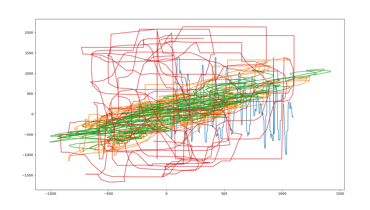
In this work, you still can see the motion which created the data – data that should have been depicted by Python’s Matplotlib library.
What the graph should have shown are the positions of multiple sensors in a motion tracking system over time in space – so the x axis should have been time (giving it the format: time, data1, data2 data3, …). But Matplotlib only used time for the first series and then paired the coordinates to themselves (assuming the format x, y, x, y, x, … – as if it was time, data1, time, data2, time, data3, …).

