Orange Shift
Xan Gregg, 2022
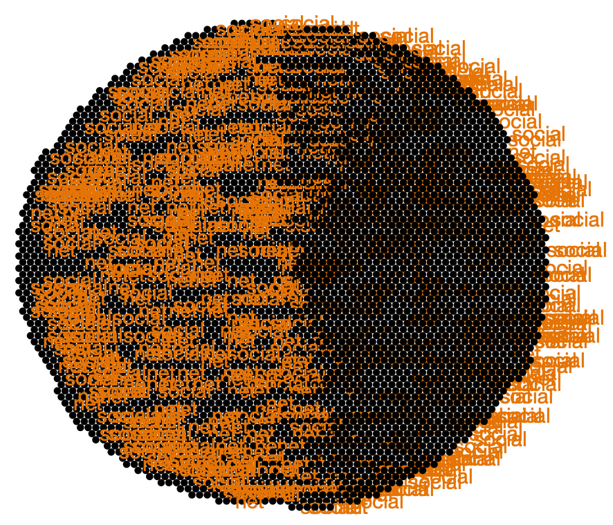
I tried to create packed circles chart, but neglected to summarize the data first. I forgot I had orange labeling turned on for some points, so all 4300+ dots are shown with the same size and and 700 colliding labels. This happened when using the JMP statistical visualization software on a data table of Mastodon instance domain names.