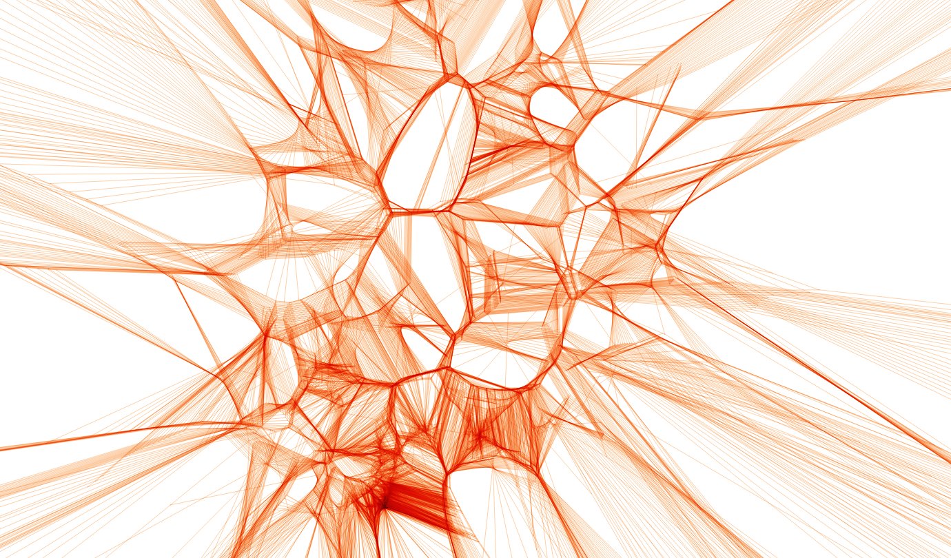
This was part of a data visualization around train positions. The image shows multiple Voronoi analyses, accidentally drawn on top of each other using QGIS. You can learn more about the background and about spatial databases in this article.

This was part of a data visualization around train positions. The image shows multiple Voronoi analyses, accidentally drawn on top of each other using QGIS. You can learn more about the background and about spatial databases in this article.